The Colour of Quiet: How Quiet Luxury Moved Beyond Beige
By Kenneth Bordewick | Beverly Hills Luxury Interiors | ÖND | Life's Breath™ · In clinical collaboration with Dr. Thom Lobe MD and Dr. Fouad I. Ghaly MD
Researchers at the University of Surrey's Department of Psychology published findings in 2021 demonstrating that environments incorporating low-saturation colour — particularly green and blue tones — produced measurable reductions in cortisol and self-reported stress compared to purely neutral environments. Participants reported feeling simultaneously more alert and more at ease: a state the researchers described as “alert calm.” For a decade, the luxury interior world has been moving in precisely the opposite direction.
Beige. Champagne. Ivory. Cream. The palette of restraint became the palette of conformity. What began as a necessary antidote to maximalist excess quietly hardened into its own orthodoxy — a neutral monoculture repeated in every penthouse and every estate, as though restraint required the abandonment of colour altogether.
At Beverly Hills Luxury Interiors, founder Kenneth Bordewick has long observed this evolution with a discerning and increasingly critical eye. The firm has spent the past decade designing for ultra-high-net-worth clients across four continents — and across that span, a pattern has emerged: the most enduringly beautiful spaces are not the most neutral. They are the most considered.
The Myth of More — and Its Opposite
Quiet Luxury, as a philosophy, was never about beige. It was always about intention. The neutrals were a tool — and an important one. They created visual calm, reduced stimulation, allowed the eye to rest. But a tool misapplied becomes an ideology. And when the entire luxury interior industry arrives at the same solution, that solution has ceased to be a philosophy and has become, instead, a market convention.
The distinction is not trivial. A room of matching champagne and ivory communicates the same thing as every other room of matching champagne and ivory: that its owner followed a trend. The rooms that endure — the rooms that one enters and immediately feels to be correct, to be authoritative, to be genuinely restorative — are those in which the designer has exercised genuine intelligence over every decision, including the decision of colour.
“The error was to mistake quietness for colourlessness. A room at true rest does not need to drain itself of pigment — it needs every pigment to be considered. The difference between a room that whispers and a room that silences is the difference between subtraction and intelligence.”
— Kenneth Bordewick
What Colour Means in the Grammar of Quiet Luxury
The evolution that Beverly Hills Luxury Interiors is championing is not a rejection of restraint. It is its deepening. Muted jewel tones do not shout. A wall rendered in deep sage does not announce itself any more than a page of fine poetry announces its metre. It simply exists at a higher register — one that the body, as much as the eye, perceives and responds to.
Slate blue in a cushion absorbs light differently to ivory. It creates shadow, depth, and visual rest in ways that a flat neutral cannot. Deep forest green in an architectural panel gives the eye a point of resolution — a place to land and remain, without the restlessness that a perfectly uniform space can, paradoxically, produce. Soft terracotta in a woven textile connects the room to the warmth of natural stone and aged plaster, grounding the nervous system in the oldest of the earth's materials.
Kenneth Bordewick has named this approach Considered Colour — the integration of muted, low-saturation hue into the Quiet Luxury vocabulary. The palette it draws upon includes sage green, slate blue, deep forest green, soft terracotta, dusty rose, and warm charcoal. Each tone is selected not for fashion, but for the precise physiological and psychological effect it produces in the body of the person who inhabits the space.
The full design discipline governing these decisions is explored at Quiet Luxury Wellness Design and Wellness Design Principles.
The Science of Subtle Saturation
This is not aesthetic opinion. The University of Surrey findings referenced above are part of a broader body of evidence establishing colour as a direct input to the human autonomic nervous system. Research by Elliot and Maier, published in the Annual Review of Psychology (2014), comprehensively reviewed the field of colour psychology and confirmed that hue, saturation, and brightness each produce distinct physiological responses — measurable in cortisol, heart rate variability, and cognitive performance.
The implications for interior design are not marginal. The body does not distinguish between the stress of a deadline and the stress of an overstimulating visual environment. It responds to both through the same hormonal cascade: cortisol rises, sympathetic nervous system activation increases, and the regenerative, parasympathetic state that deep rest requires becomes difficult to access.
This is precisely the reasoning behind the wellness design framework at ÖND | Life's Breath™, developed by Beverly Hills Luxury Interiors in clinical partnership with two of the most distinguished figures in longevity medicine: Dr. Thom E. Lobe MD, a paediatric surgeon and integrative medicine pioneer with four decades of clinical experience, and Dr. Fouad I. Ghaly MD, a physician specialising in regenerative and longevity medicine.
“We have always known, in medicine, that colour exerts physiological consequence,” notes Dr. Thom Lobe MD. “The question is whether interior design acts on this knowledge with precision. The BHLI approach does.”
The Quiet Luxury Framework in Full Colour
Kenneth Bordewick's proprietary Quiet Luxury Framework does not prescribe a palette. It prescribes a discipline. Every colour decision must answer three questions: Does this serve the body? Does this honour the material? Does this deepen the silence of the room rather than disturb it?
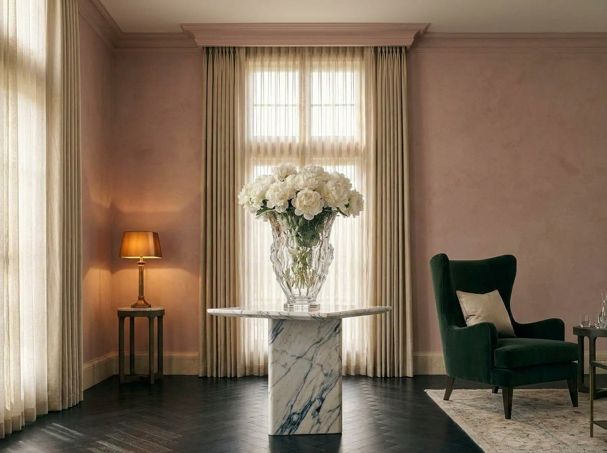
Applied through the Beverly Hills Luxury Interiors atelier, this discipline produces spaces that are visually richer than the champagne-only interiors of recent years — yet no less serene. A library lined in deep forest green panelling, with a limestone fireplace and a single crystal vase of white peonies, is quieter than a room of matching beiges precisely because the eye has something of substance to rest upon. The green absorbs, rather than reflects. The stone grounds. The crystal punctuates without competing.
These are the environments Beverly Hills Luxury Interiors has created across four continents — from Beverly Hills estates to the palaces of the Persian Gulf, from the penthouses of Manhattan to commissions throughout Europe and Asia. The Considered Colour approach is not a trend. It is the next articulation of a design philosophy that has always held one principle above all others: every decision is earned.
Commission Your Longevity Home Wellness Design Audit
If your current environment speaks in a single, exhausted register — or if you sense that something more considered is within reach — we invite you to commission a Longevity Home Wellness Design Audit with Beverly Hills Luxury Interiors.
This bespoke assessment examines your living environment across every sensory and biological dimension: colour and light, material and texture, acoustic quality, air purity, and the invisible forces that govern how a space feels at the cellular level. It is the first step toward a home that does not merely impress — but truly restores.
Enquire at beverlyhillsluxuryinteriors.com.
Sources: University of Surrey, Department of Psychology, Environmental Colour Studies (2021) | Elliot & Maier, “Color Psychology: Effects of Perceiving Color on Psychological Functioning in Humans,” Annual Review of Psychology (2014) | Kaplan, “The Restorative Benefits of Nature,” Journal of Environmental Psychology (1995) | Dr. Thom Lobe MD, Clinical Partner, Beverly Hills Luxury Interiors | Dr. Fouad I. Ghaly MD, Clinical Partner, Beverly Hills Luxury Interiors
Kenneth Bordewick | Beverly Hills Luxury Interiors | ÖND | Life's Breath™
Commission Your Longevity Home Wellness Design Audit
Begin with a comprehensive assessment of your home's biological environment — light, colour, material, acoustics, air, and water. Delivered by Beverly Hills Luxury Interiors in clinical collaboration with Dr. Thom Lobe MD and Dr. Fouad I. Ghaly MD.